(It's easy to get me to do something if it involves opening snap.love)
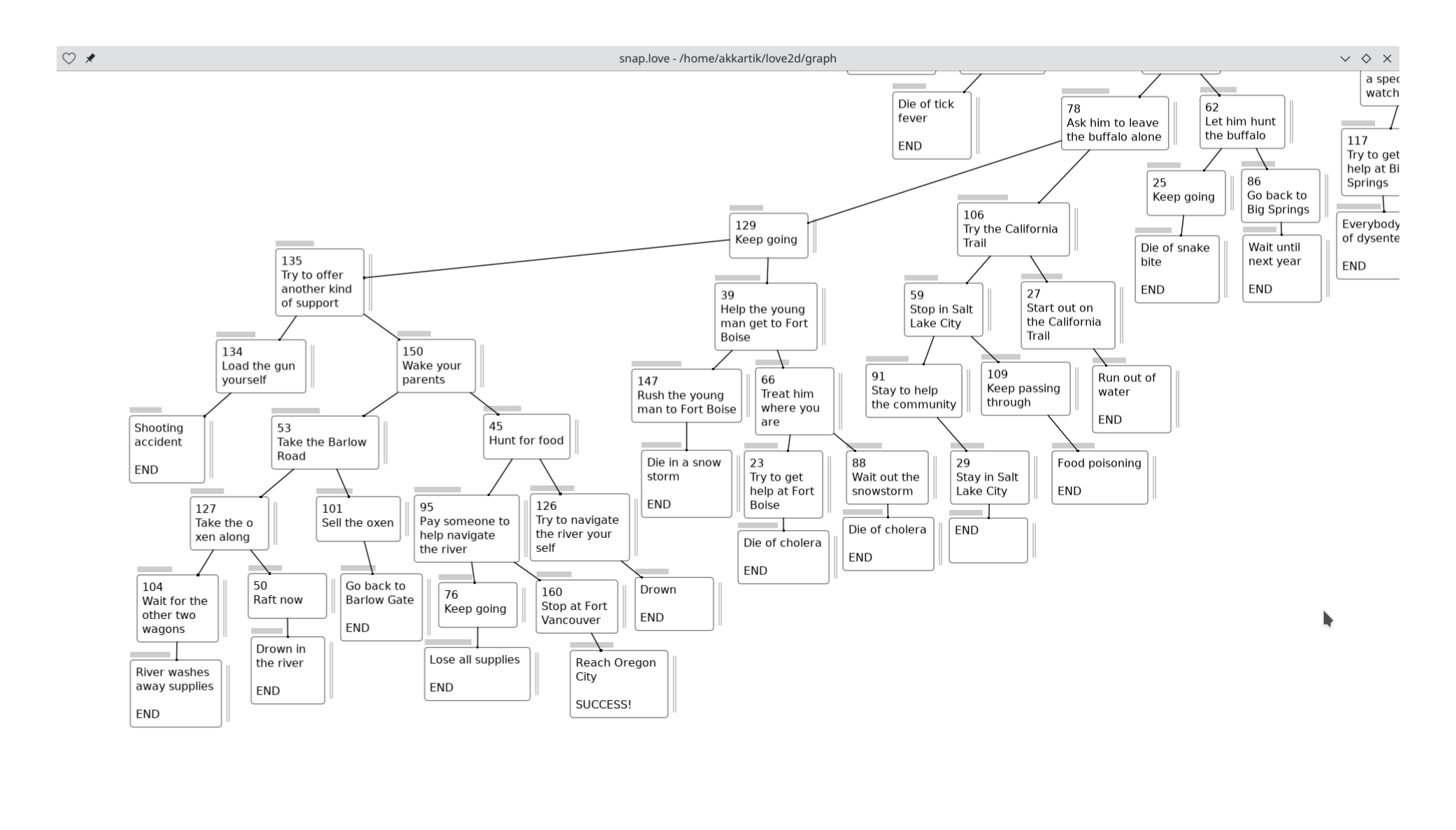
After finishing the map, I've been paying attention to the "meta game" of manually adjusting box positions and widths (height depends on amount of text) to make the arrangement pleasing to the eye. Constraints I've grown conscious of during this process:
- Lining up child nodes vertically
- Lining up nearby nodes. (imperfectly)
- Avoiding long edges.
- Keeping nearby edges approximately the same length.
I'd appreciate if anything seems jarring in this image, or if you have new OCD rules to infect me with :)
One frustration: I spent a while adjusting widths of boxes to not wrap lines within words, only to find that adjusting zoom messes things up again. This is an old problem: I can have precise scaling or crisp text, but not both. All my apps choose the latter.
This post is part of my Freewheeling Apps Devlog.
Comments gratefully appreciated. Please send them to me by any method of your choice and I'll include them here.