My notebook app does simple variants of 2 and 3, and replaces 1 with explicit in-document markup.
Now I'm playing with another approach to 1. I already have the idea of pivots from my doodle app. Putting two of those pivots together should yield a range that adjusts in intuitive ways in the presence of edits. An example may be a WYSIWYG UI for adding a hyperlink to some text:
Inserting/deleting text before a range moves it.
Inserting/deleting text after a range leaves it unchanged.
Inserting/deleting text within a range grows/shrinks it.
Deleting text at a boundary shrinks the range, and only deletes the attached attributes if the range becomes empty. This makes ranges more robust to deletion than my doodles which attached to a single pivot.
Inserting text at boundaries can't always do what you want. I imagine it'd be nice to have handles that you can drag to adjust a range.
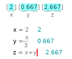
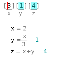
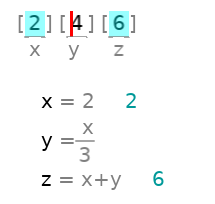
I hadn't tried this until today, but it turns out to work: I can create equations forwards and back in notebook.love, and trigger either selectively based on what blanks I fill in.
The fine print: to switch directions I have to fill in the right blank, clear the old blank, and then type in something outside the old blank (to indicate I'm not going to type further into the old blank).
Works better if I clear the old query first, but who can remember that?
I've decided to just recompute on every keypress and mouse click. It seemed unnecessary, but now I see that there's some benefit from the inefficiency.
I'm instead using the game engine idea of a pivot. Any time I toggle into doodle mode I have to first pick a pivot from one of the characters on screen. All my drawings are relative to that pivot, and edits to text maintain pivots alongside.
Displacements to the pivot are preserved in font-derived units, so it looks "reasonable" as you resize the font.
Deleting a character deletes all drawings pivoted on it. (But there's undo.)
This took 200 lines, so not too much though it was more than I'd initially expected.
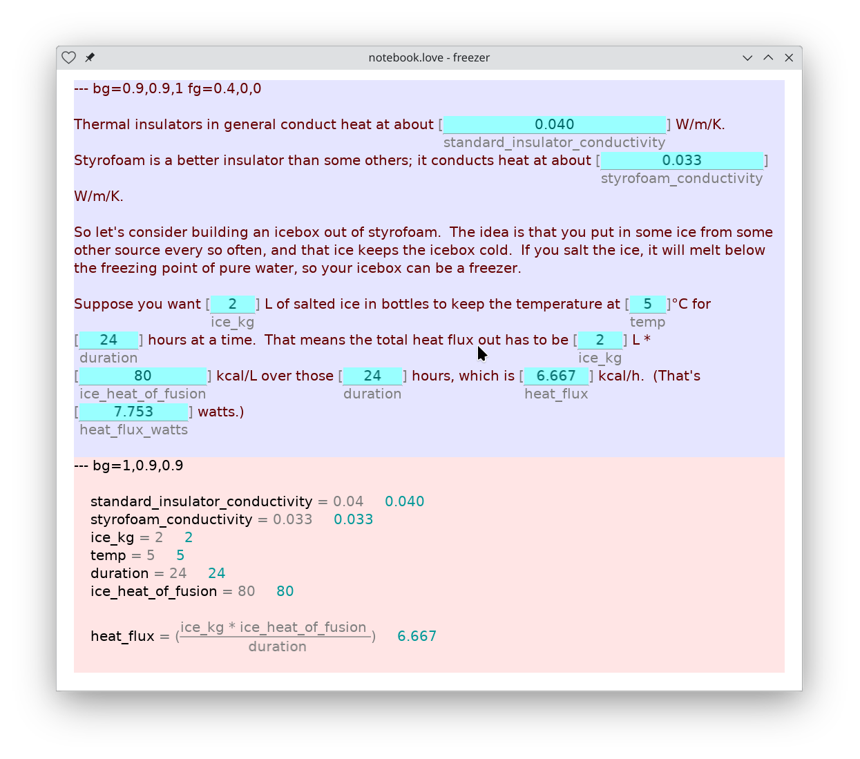
Blanks can be filled in either with the results of computation or with what a
person typed in. Now we indicate such conflicts in two ways.
Blanks filled in from computations get a distinct look (the cyan background), separate from both hand-written (black on white) and computed, non-editable text (cyan on white)
If I manually edit a blank, its background changes, and any code that was overridden doesn't execute. Here are a couple of examples:
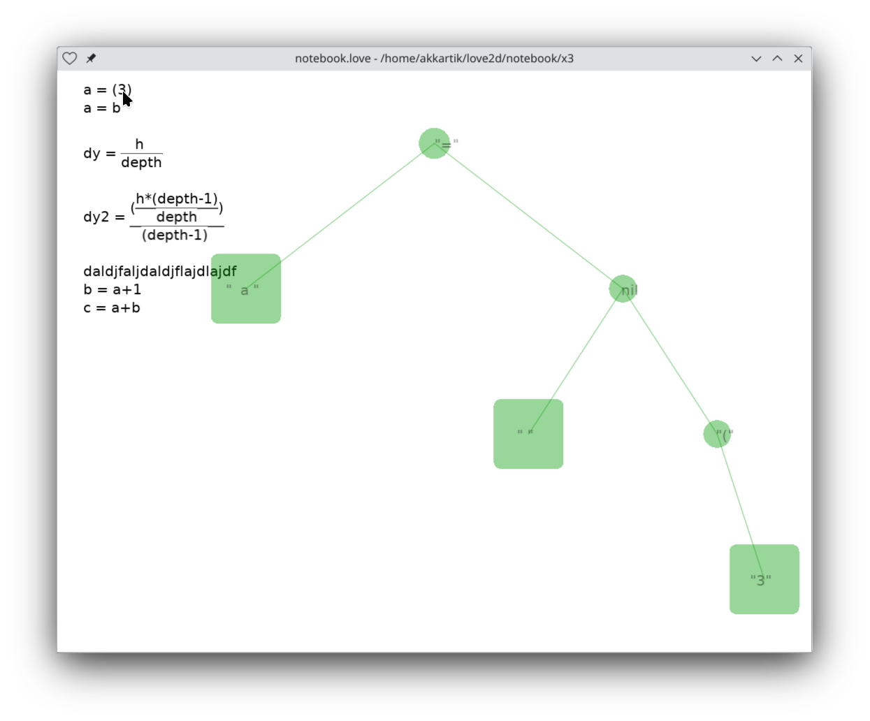
This debug UI has been surprisingly handy over the last few days. I'm able to visualize a parse tree even after it's been flattened, just using color transparency. All I'm doing is painting all the rects that contain the mouse cursor. Since the color is transparent, it doesn't matter what order they're in. (The larger rects actually come later; they're fall-backs if a more fine-grained rect isn't found.)
I spent several hours trying to debug my notebook app last night, getting increasingly frustrated and demoralized. Eventually I realized there's a bug in my parser. It's a drag having to redo something I thought I was done with.
This morning I went back and built a debug UI for the parser, and now it shows the bug at a glance. The parse tree in the background is for the line the mouse pointer is hovering on.
I need to learn to switch gears more quickly from:
"This should be easy, I suck."
to:
"I'm having trouble with this, it must be hard."
One fun thing is the couple of lines in the middle there. I reached for a notebook to scribble some equations for myself, but then realized all I wanted was to be able to draw the fraction line horizontally -- and I'm sitting in a tool that can do that. Using the tool to debug the tool :boom: (At least until I have no tools because I broke my tools using my tools.)
It looks like I care about always making the styling very transparent, so it's possible in principle to guess what characters one needs to type to copy the look of something one sees on screen. So the style directives will never be hidden.